Twinkle
Design a simplified customer journey with user-centered principles

Overview
Simplicity Makes Twinkle Stand Out
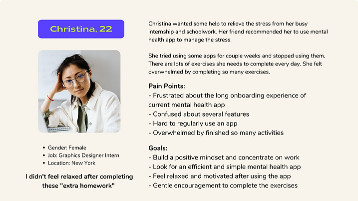
Twinkle is a mental health app. It helps people discover simple pleasures in daily lives and motivate the self-discovery journey. What made Twinkle stand out in the mental health app market is the simplicity of the key feature. Less is more. Only completing one daily activity can make changes in your life. Small changes make a difference! We received 84.6% satisfaction rate from usability testing. The app is expected to launch at the end of 2022.
My Role
UX designer, UX researcher
Responsibilities
UI/UX Design, User Research, Usability Testing, Project Management
The Team
Britt Du, Kain Ip, Sanniya Zhou
Duration
5 weeks (01/2022-02/2022)
Background
When the team struggled in the project pitch with an intense timeline, I suggested we could think out loud for every single idea we had. It turned out an engaging brainstorming workshop works well for sparkling new ideas. One of the teammates mentioned she sometimes felt depressed because of job hunting and schoolwork. Suddenly, each of us found something in common. We all shared how we felt stressed about school and work. Therefore, our initial thought was to design a mental health app which can help people manage and relieve stress. We want to help college students who are struggling with the “quarter-life crisis”.
The app’s purpose is to help people relieve stress. Twinkle helps users build positive mindsets by recognizing simple happiness in their lives.
Problem Discovery
Dig into Users' Actual Pain Points
👩💻Secondary Research
While major depression can develop at any age, the average age at onset is in the mid-20s. An estimated 26% of Americans ages 18 and older -- about 1 in 4 adults -- suffers from a diagnosable mental disorder in a given year according to the National Institute of Mental Health Disorders.
Current market focus on these areas:
-
Match with therapists
-
Monitored habits and emotions
-
Educated about mental health issues
-
Completed activities to address negative emotions
Through our research, we identify the customer opportunity in the market by discovering the demand for mental support is continuously growing. Then, we decided to conduct in-depth interviews to dive deep into personas and identify patterns and their pain points of current experiences.
🌟 In-depth interview:
We conducted 8 one-on-one interviews over zoom to ask participants questions related to: triggers for depression, the negative influences of experiencing stress, perspectives about using mental health app…
📃 Findings:
Common Frustrations:
-
Faced Peer pressures
-
Applied for job
-
Kept up with coursework
-
Faced culture shock
-
Got lost in the career path
Leading to Negative Consequences:
-
Lost motivation for work and school
-
Isolated from social activities
-
Had hard time to concentrate on work
-
Experienced low self-esteem
😠 User Pain Points:
-
No solid or actionable suggestions
-
Complex features overwhelmed users
-
Give up using the app because of losing interests
🥳 User Needs:
-
Build positive mindsets
-
A caring and relaxing vibe
-
Easy and simple to use the app
-
Lasting motivation of using the app
Persona
🌟 By conducting research, we narrowed down the project scopes and identified users’ pain points of using mental health apps. we reframed the problem and found the root of Twinkle.
Reframed The Problem
How might we help college students relieve stress in an engaging way?
How might we design a product to stand out in the mental health app market?
How might we retain users to continuously use the app?
Design Goals
User-centered Design Principles
To differentiate Twinkle and stand out in the mental health application market, we focus on four goals:
-
User-centered experience: Put into users' shoes to design the key features to target the core needs.
-
Simplicity: We don’t want to overwhelm users with complex features or complicated user flows.
-
Immersive experience: Give users the feelings of relieving, supporting, and inspiring.
-
Retention: Encourage users to build the habits of using the app.
Along with the entire project, we kept these supporting goals in mind to make sure we are on the right track.
Ideation
Explored the Key Features to Target Users' Core Needs
Challenge: Determine key features of the app
Solution: Ideation Workshop & Customer Journey Map & Storyboard
We have an intense brainstorming workshop to generate ideas. :)

Top 5 ideas:
-
Functionality
-
Sharing
-
Tracking progress
-
Gamifying the experience
-
Rewarding system
To analyze users’ needs and pain points at each touchpoint, I utilized the customer journey map to identify opportunities.
I divided the customer journey into five stages :
-
Discovery: Why would they start the journey?
-
Onboarding: Why would they trust us?
-
Exploring key features: How can they feel relieved by using the app?
-
Sharing: Why would they invite others?
-
Retention: Why would they keep using the app?
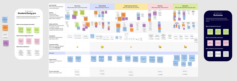
👀 After analyzing touch points of different stages, we decide to focus on four major features that best target users' core needs.
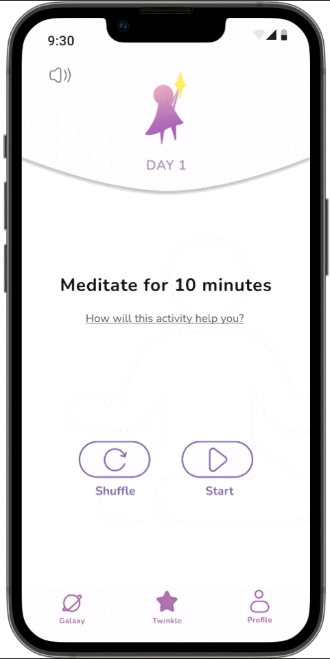
1. Offer only one activity per day
2. Record the mood/activity
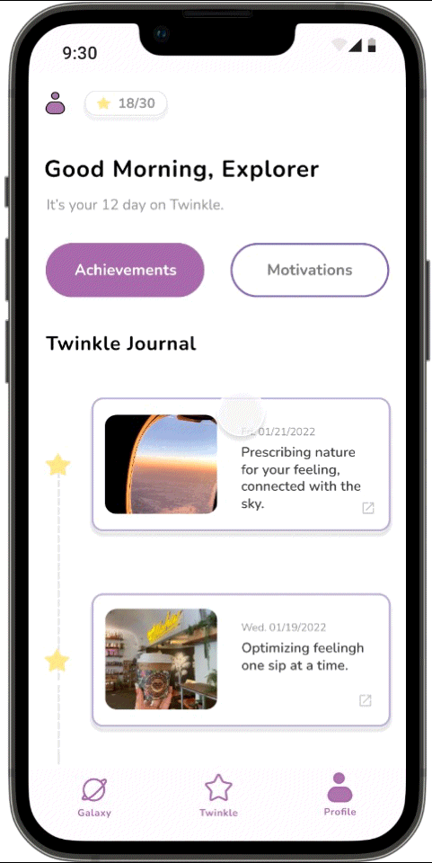
3. Share feature: motivational reports & achievement
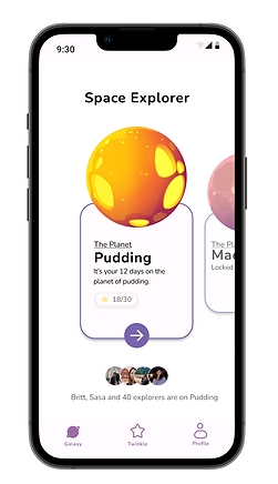
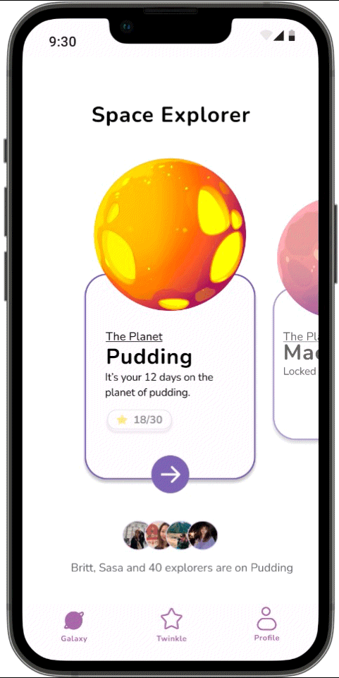
4. Rewarding system : collection “stars” to unlock “new planets”


Gathered Actionable Insights
Iteration

Testing Findings:
1. Navigation bar is confusing.
2. Users want to know how they can benefit from completing the activity.
3. Users are confused with the adventure journey and the rewarding system.
4. Users are confused with the motivational report and the accomplishment.
Key Insights:
1. Intrigued users to take the daily activity.
2. Differentiated motivational report and the accomplishment
3. Informed adventure journey and the rewarding system.
Mid-Fi Iteration
Testing Helps Optimize Design Solutions
Research method: Qualitative research and quantitative research
We conducted 5 moderated user testings and 26 unmoderated user testings to gather user feedback. For the Hifi mock-up, we focus on three main areas: Tailored daily practices, kick-off self discovery journey, and creating an immersive experience.
🪐 Design Solution One: Tailored daily practices
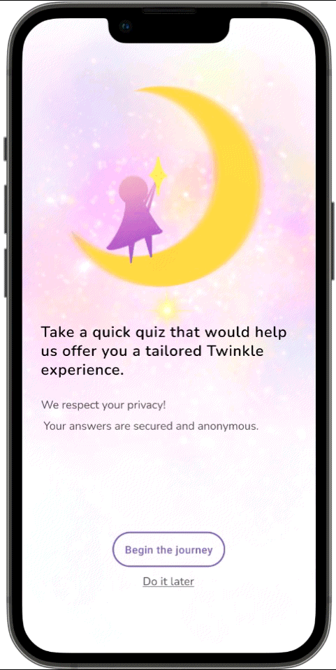
🌟 Offer personalized quizzes to recommend daily activities targeted to users’ interests.
2 out of 5 participants intended to check the total number of questions.
5 out of 5 participants intended to click multiple choices for the question.

🌟 Design daily activities in an intuitive way.
3 out of 5 participants reported that they didn’t notice “ How will this activity help you?”
73% of participants reported that the biggest confusion is the activity selection, especially switching activity.
84.6 % of participants reported that the icons in the navigation bar are confusing.

🪐 Design Solution Two: Kick-off self-discovery journey
🌟 Record your mood and the fun/grateful/hilarious moment ~~~~~The beginning of discovering happiness in daily life.
3 out of 5 participants reported that they met struggles when using the journal feature.


2 out of 5 participants reported that the feature of the "favourite journal" is confusing. They didn’t know if " favourite journal " is for public or personal use.

🪐 Design Solution Three: Creating an immersive experience
🌟 Gamify the exploring journey.
Our team held a long~day workshop to brainstorm the world ideology and the storyline of Twinkle. Our goal was to let users drown to the story concept and start their self-discovery journey.
After
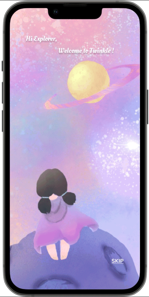
We added the background story in onboarding stage.


Each user is an unique space explorer. He/She could collect rewards to unlock the other planets ( macaron, cupcake, donut~)
Final Design
Embraced the Simple Joy at Twinkle
✅ Tailored daily practices
One Daily Activity
~~" It's simple to only do one activity every day. I like it. "
~~" These activities are based on my interests and simple to accomplish. ”
Personalized Quiz
~~" I like the privacy statement, it makes me feel secure. "
✅ Kick-off self- discovery journey
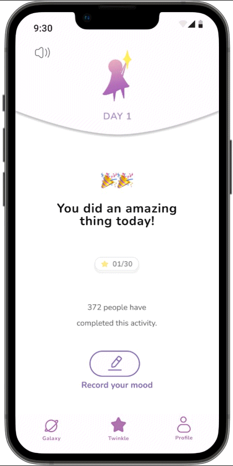
Record Mood
~~" I like the recording feature. I can record my emotions and thoughts after finishing the activity. "
Track Progress & Achievements
~~" It's useful to track my progress and remind me of those joyful moments. "
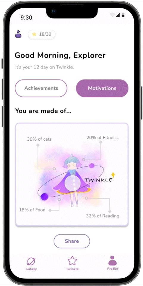
Sharing Motivational Reports
~~" I like the motivation report because it shows the breakdown of my interests."
76.9 % of participants are willing to share the motivation reports with their friends
✅ Creating an immersive experience
Onboarding Story
~~" Love the concept and theme! "
Gamifying the experience
~~“ I like the feeling that I'm away from the Earth and nobody knows me in this universe. ”
🎯 Success Metrics:
1. 84.6% of participants are willing to use the app and recommend it to their friends.
2. 76.9 % of participants are willing to share the motivation reports with their friends.
3. One of the users offered to help launch the the app.
(YES!! We are working on iterating the design and packaging the final designs to be handed off to the engineer. I am looking forward to launching the app~)
Lesson Learned
Narrow Down The Project Scopes to Focus on Design Goals
🤔 A struggle I met in the ideation stage:
We faced a conflict when deciding on the features. While holding workshops and gathering feedback from peers are helpful, we still have different voices regarding the key feature. One teammate suggested we should also design more features that are included in similar mental health apps, such as sharing articles/videos about mental health issues, creating a community discussion board, and matching with therapists.
In this situation, I suggested we should review our design goals and user pain points. A key question is “ Do our targeted users require all these features to meet their goals? How can we simplify the solutions?”
Simplicity is our top priority because it would make Twinkle stand out from similar apps. Our targeted users are looking for an app which is simple and efficient along with the main functions. Therefore, after we listed out all the pros and cons and design goals, we all agreed to keep main features simple and efficient.
Here's the lesson I learned, always put users front and center. Narrow down the project scope to focus on the design goals.
✌️ Takeaways:
1. Conducting usability testing can be helpful to narrow down personas. We have conducted testing for paper prototypes, mid-fi wireframes and hi-fi wireframes. Despite collecting feedback about features, we better understand our targeted users. We discover female users are more into the immersive experience and gamifying experience from user testing results. Therefore, we narrow down our persona to “female college students who experience stress".
2.Tailored back to design goals and users’ pain points when making design decisions. At each stage of the design process, I keep this principle in mind to craft design solutions. All the features should be designed to meet users’ goals instead of meeting designers’ goals.

